The schedule is out 🗓️ for POSETTE: An Event for Postgres 2026!
This post by Claire Giordano and Pouria Hadjibagheri was originally published on the Microsoft TechCommunity Blog.
Update in October 2022: Citus has a new home on Azure! The Citus database is now available as a managed service in the cloud as Azure Cosmos DB for PostgreSQL. Azure documentation links have been updated throughout the post, to point to the new Azure docs.
From the beginning of the COVID-19 pandemic, the United Kingdom (UK) government has made it a top priority to track key health metrics and to share those metrics with the public.
And the citizens of the UK were hungry for information, as they tried to make sense of what was happening. Maps, graphs, and tables became the lingua franca of the pandemic. As a result, the GOV.UK Coronavirus dashboard became one of the most visited public service websites in the United Kingdom.
The list of people who rely on the UK Coronavirus dashboard is quite long: government personnel, public health officials, healthcare employees, journalists, and the public all use the same service.
“While ministers and scientists are able to see individual data sets before the public, the dashboard itself is an example of truly democratized, open-access data: the latest graphs and someone sitting at home in Newcastle sees the latest trends and graphs for the first time at 4pm, the same moment as Boris Johnson [the Prime Minister] in his office in Downing Street does.”
—The i newspaper, 12 February 2021, Behind the scenes of the coronavirus dashboard
In addition to exemplifying the value of open-access data, the UK Coronavirus dashboard is open source. All of the software, and the SQL queries themselves, can be found on GitHub, under the MIT license with the data available under the Open Government License 3.0.
Accessibility is another important design principle. The dashboard is designed for people with different disabilities. The interface is simple to use and enables anyone to navigate the data, letting you visualize trends over time and across geographic regions.
This post is a deep dive into how the UK Coronavirus analytics dashboard came to be, and why it’s architected the way it’s architected. In this post you’ll learn about the database challenges the team faced as the dashboard needed to scale—with an eye toward how the UKHSA team uses Azure, the Azure Database for PostgreSQL managed service, and the Citus extension which transforms Postgres into a distributed database.
The birth of the UK Coronavirus dashboard
The earliest UK Coronavirus dashboard was a simple dashboard using ArcGIS.
This was quickly replaced by a simple, single-page service. In April 2020, when the GOV.UK Coronavirus (COVID-19) dashboard first went online (UK National archive of the original 15 April 2020 dashboard here), it contained just 4 metrics:
- number of cases, daily
- number of cases, cumulative
- number of deaths in the UK, daily
- number of deaths in the UK, cumulative
Soon after, the NHS turned the project over to Public Health England (now called UKHSA), an executive agency of the UK’s Department of Health and Social Care, to enhance the application. That is when Pouria Hadjibagheri became involved.
The technical and development lead for the GOV.UK Coronavirus dashboard at the UK Health Security Agency (UKHSA, formerly Public Health England) is Pouria Hadjibagheri, the Deputy Head of Software Engineering for Data and Web Services. Since April of 2020, Pouria has led the technical aspects of the mission to gather and publish daily statistics on the coronavirus pandemic in the UK.
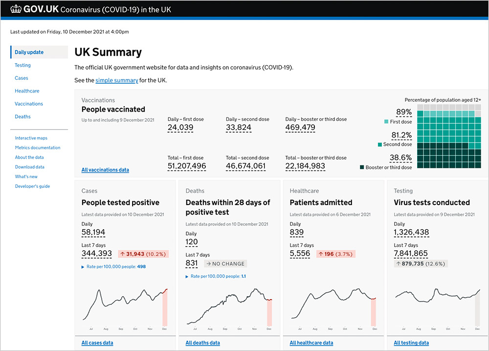
When the UK government started to use the dashboard in its daily coronavirus briefings
In June of 2020, Pouria’s team was in the midst of architecting and evolving a more scalable system to power the application. Then they were asked to enhance the online dashboard so it could replace the slides being shared in the UK government’s daily coronavirus briefings—and so they did.
At that point, there were about 1,500 online users of the dashboard at peak times during the day. And then the UK Prime Minister tweeted the URL to the dashboard. Boom.
All of a sudden, there was a surge in the number of users, all the way up to about 80,000 users within five minutes. From then on, the number of average daily users was 30,000 to 40,000, and it just kept going up.
Over the next year, Pouria’s team expanded the analytics dashboard, adding in more metrics and more interactive features. Today, the application has an average of 1 million unique users per day, generating up to 70 million hits per day.
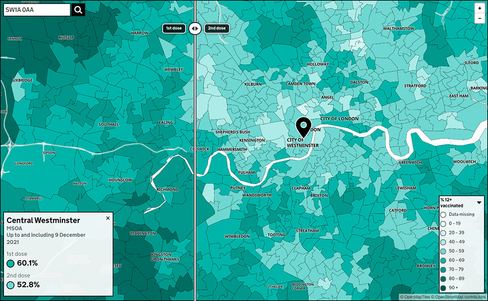
Entire time series data set—currently 800M rows of data—gets updated each & every day
At first, the analytics dashboard only included data from a small number of sources, such as data from press conferences, tweets, or announcements made on the NHS website.
As the project grew, like so many analytics applications, people wanted to answer even more questions with the dashboard; and so, the team began collecting more data from more sources.
Today hospitals report the data to the NHS, and the NHS reports it to the UKHSA team. The team also established robust links to obtain data from different sources, including arrangements with:
- Offices of national statistics for the UK nations to get statistics based on death certificates
- National Health Service (NHS)
- Departments of Health and Social Care to get testing data
- National Immunisation Management System to get vaccination data
- Public health agencies to get data on cases and deaths
Even though some of these data are already in the public domain by the time the dashboard is updated at 4pm, most people wait until 4pm before they use the data. The main reason for this is that the UK Coronavirus dashboard gives users a platform from which they can download consistent and well-structured data that has been QA’ed. They also get to see visualization, with the ability to download exactly what they need, and in the format they need.
At the time this post was published, the analytics dashboard and its underlying database—the Azure Database for PostgreSQL managed service—process over 55 million data points every day, aggregated in the data pipeline from approximately 800 million rows sent by different sources.
The UKHSA team also updates the entire time-series data set daily. The deduplications, corrections, identifications—all of these happen every day on the entire data set to ensure the accuracy and integrity of each publication.
As a result, there are now over 7.5 billion records in the distributed PostgreSQL database (that’s not rows, rather, these are records, as some are nested JSON payloads). The total number of records goes up by over 50 million each day.
In parallel to this increase in the number of data sources and the amount of data, the UKHSA team also added new features and capabilities to the analytics dashboard in some pretty significant ways, by adding:
- downloadable data sets (you can download any part of the data that as published on a specific date in the past)
- new visualizations
- new search capabilities
- interactive capabilities across 6 administrative and healthcare boundaries with different levels of granularity
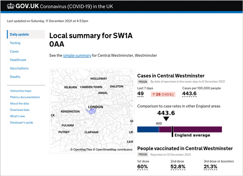
For example, you can search on postcodes to quickly see data on testing, cases, vaccinations, hospital admissions, and deaths. You can even use an interactive map to visualize which areas have the greatest percentage of first and second vaccination doses.
"By the numbers" view of the UK Coronavirus analytics dashboard
The metrics in this table should give you a feel for the size and scale of the UK Coronavirus dashboard at the time of publication in December 2020.
| AMOUNT OF ACTIVITY (as of Dec 10, 2021) | |
|---|---|
| # daily average users | 1.5 million |
| # concurrent users/min, at peak | 85K-100K |
| median # requests hitting CDN at peak | 250K |
| total # daily requests (hits) | 78 million |
| # weekly pageviews | 80 million |
| # daily downloads | 7.8 million |
| VOLUME OF DATA (as of Dec 10, 2021) | |
| # metrics published daily | 215 |
| total # data points published per day | 55 million for 8000 areas |
| # records in PostgreSQL database | 7.5 billion |
| # rows in PostgreSQL database | 5.9 billion |
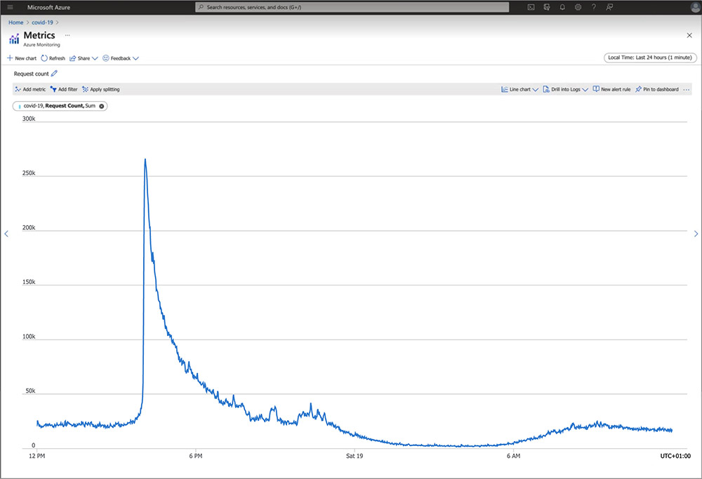
The performance challenges of scaling with high concurrency
Today, the number of users querying the analytics dashboard peaks each day at 4:00pm, when new data is released.
There might be 30,000 concurrent hits per minute right before 4pm. Then as soon as the data are released, it goes up to 250,000 to 300,000 hits per minute. The service has been designed to immediately start caching new requests, but at the 4pm daily release time, almost all of the hits get to the server, as that is the point at which all caches are flushed to make new data available.
The number of concurrent users at peak is 60,000 to 100,000 depending on day and prevalence— and that’s just the people browsing the actual website, not users who are using the three APIs.
If database responses are even the slightest bit slow, users will feel it. Providing near real-time query responses is paramount. The difference between 200 and 300 milliseconds is the difference between the website being responsive, or not.
Why is a difference of just 100 milliseconds a big deal—especially during the peak? Additional latency can trigger a negative domino effect of performance issues, triggered by the back-pressure of asynchronous services. Even though the asynchronous services are throttled, the number of incoming requests keeps growing. Eventually, left ignored, the incoming requests will likely fail because they will time out.
It can get worse: attempts to try to handle the higher number of incoming requests will increase processing time—which in turn might prompt horizontal scaling of the number of application servers. Each new server would establish more connections to the database, which increases the load on the database, which makes it harder still for the database to respond to incoming requests. Hence: a domino effect.
What is back-pressure? Synchronous services wait for the system to respond before issuing the next request, which means they are not always able to fully utilize the hardware when there are additional requests. Conversely, asynchronous services issue requests without waiting and are thus able to take advantage of parallelism in the database. However, they might issue more requests than the hardware can handle, which can cause significant slowdowns and failures: this is a phenomenon known as back-pressure. Asynchronous services therefore need a mechanism to handle back-pressure, for instance by limiting the total number of concurrent requests to the database.
Eleven months earlier at the beginning of 2021, as the number of concurrent users querying the dashboard continued to spike, the application was starting to face some serious performance issues.
To support this high level of concurrency led the team to decide they needed a distributed database. But which one?
The search for a distributed database
In January 2021, after experimenting with the database and running many, many tests, Pouria decided to move the application to run on Hyperscale (Citus) in the Azure Database for PostgreSQL managed service. Hyperscale (Citus) uses the Citus extension to Postgres—an open source extension that transforms Postgres into a distributed database.
At the time of writing, the Citus distributed database cluster adopted by the team on Azure is HA-enabled for high availability and has 12 worker nodes with a combined total of 192 vCores, ~1.5 TB of memory, and 24 TB of storage. (The Citus coordinator node has 64 vCores, 256 GB of memory, and 1 TB of storage.)
Why Postgres?
Why Postgres? Pouria wanted the database integrity—and the ability to join and aggregate data—that you get from a relational database like Postgres. And he also wanted the versatility of being able to handle NoSQL-style, loosely-structured data—which is something Postgres also offers.
PostgreSQL has always been Pouria’s preferred RDBMS (relational) database. He and his team had a lot of experience with the nitty gritty of Postgres—and are very comfortable with it.
Support for the Python ORM mattered
In Python, there are several readily available Object Relational Management [ORM] libraries that support PostgreSQL, so the team didn’t have to write an adapter or wrapper for connecting the application to Postgres.
Postgres has established drivers, is supported by all major frameworks in all major languages, plus existing tools to connect to databases and third-party tools. It immediately reduces the workload. When you’re using Postgres together with Python, you don’t have to reinvent the wheel each time you want to do something with the database. And that is an important consideration for a fast-moving project.
The ability to scale was a key requirement
With PostgreSQL, you can use the Citus extension to scale out the database horizontally. And on Azure, Citus is available as a managed service, called Hyperscale (Citus).
To handle the ever-growing demand for more data, there was need for a database that could scale, and that could scale as high as the project demanded.
The team found that principles of sharding employed by Citus were both easy to understand and adopt. The robustness of Citus had already been demonstrated by the positive feedback from other organizations who were already using Citus. After much testing and comparison of different database options, they concluded that Hyperscale (Citus) was exactly what he needed, and that the Citus extension to Postgres could sustain the workload in a distributed fashion. Hence, a future-proof solution.
The need for HA drove UKHSA to use a managed database service in the cloud
Because the coronavirus dashboard is a critical service that laypeople, civic leaders, healthcare workers, hospitals, and government agencies all rely on, it was important to use a managed database service that could give them reliable backups, support, security, and recovery/restore capabilities.
The UK Coronavirus dashboard relies on a holistic suite of services on Microsoft Azure
The UKHSA team leverages so many Azure services. Some of these Azure services are simply not available on other clouds. Namely, Citus is only available as a managed database service on Azure—and the team neither had the time nor the staffing to deploy and manage the database themselves. Another example of a unique service in Azure used in building the dashboard is Azure Functions—the serverless infrastructure in Azure—which offer durable functions for orchestrating distributed jobs.
And of course, support also matters, 24x7. Azure customer support has been helpful and responsive, on any and at any time of the day.
Postgres support for JSON and JSONB is more than just a crowd favorite
The UKHSA team’s Postgres database—well, actually, it’s a distributed database because the team is using Hyperscale (Citus) on Azure to distribute the database across a cluster—has about 7.5 billion records, including nested JSON payloads.
With Postgres, you can essentially combine the relational aspects of SQL with the flexibility of NoSQL databases. Pouria’s team stores every value in the Postgres database as a JSON payload—either a JSON object or JSON array. They give props to the way Postgres handles JSON formats and payloads, and the ability to use GIN indices to optimize SQL queries.
Open source, open data, & transparency as guiding design principles
The fact that PostgreSQL is open source was another important factor
One of Pouria’s conditions for working on this project was that it had to be open source. Being able to see the actual code base is an important factor in many applications. This is a service that people need to trust, and for Pouria, that meant people should be able to see the code and ensure it is high quality. Everything had to be open source.
The dashboard’s entire code base is open source, due in good part to Pouria’s belief in the value of open source. You can find 15 coronavirus-dashboard repositories on GitHub. The UKHSA team has received code contributions from all over the world; and the code has been reviewed extensively by people who are experts in this type of data collection and analysis.
The result of this open source commitment: transparency to the public, more trust in the dashboard, and improved security.
Speaking of transparency, you can also get a glimpse into the kinds of things that Pouria’s team deals with every day by looking at the Coronavirus dashboard’s "What’s new" page, where you’ll see the data issues, new metrics, changes to metrics, and other updates.
It helps that Citus is open source, too
The fact that you can use Citus open source locally was an important factor, too. It helps that the code Pouria and his team wrote—which has been written with the Citus distributed database in mind—can be run locally by just creating a Docker container and running that code in the container. Citus being open source has enabled the UKHSA team to develop quite comprehensive, containerized test suites.
Another benefit to running on top of open source technologies is the transparency into what’s happening in the code—and the ability to file issues directly with the developers on GitHub. As Pouria worked to optimize and improve the analytics dashboard, he ended up filing several issues in the GitHub repo, including the bulleted issues below. Most of the issues Pouria filed have since been fixed on GitHub.
- Altering (ENUM) types fails with err 57014
- Failure to create composite indices on distributed tables that are partitioned
- Dropping partition sets permanent lock & the partition never drops
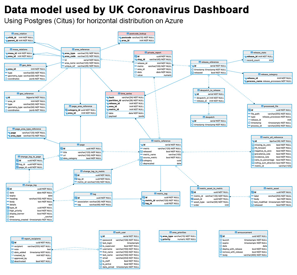
Combining Postgres range partitioning & Citus sharding to scale a time-series workload
The UKHSA team has been able to scale their analytics application—while still delivering sub-second query response times to their users—by capitalizing on the Citus ability to distribute data and queries across the database cluster. Or, to use the Azure terminology, across a Hyperscale (Citus) server group.
In addition to sharding and distributing Postgres with Citus, the team also makes extensive use of the Postgres range partitioning feature. Each day’s worth of data is currently split into five Postgres partitions based on area type.
When the analytics dashboard sends a query to the database, it does not query the entire time-series table. Rather, only the relevant Postgres partition is queried. Pointing directly to a partition1 that does not contain more than 10 or 12 million rows speeds up query responses quite substantially.
Sharding strategy: choosing a distribution column
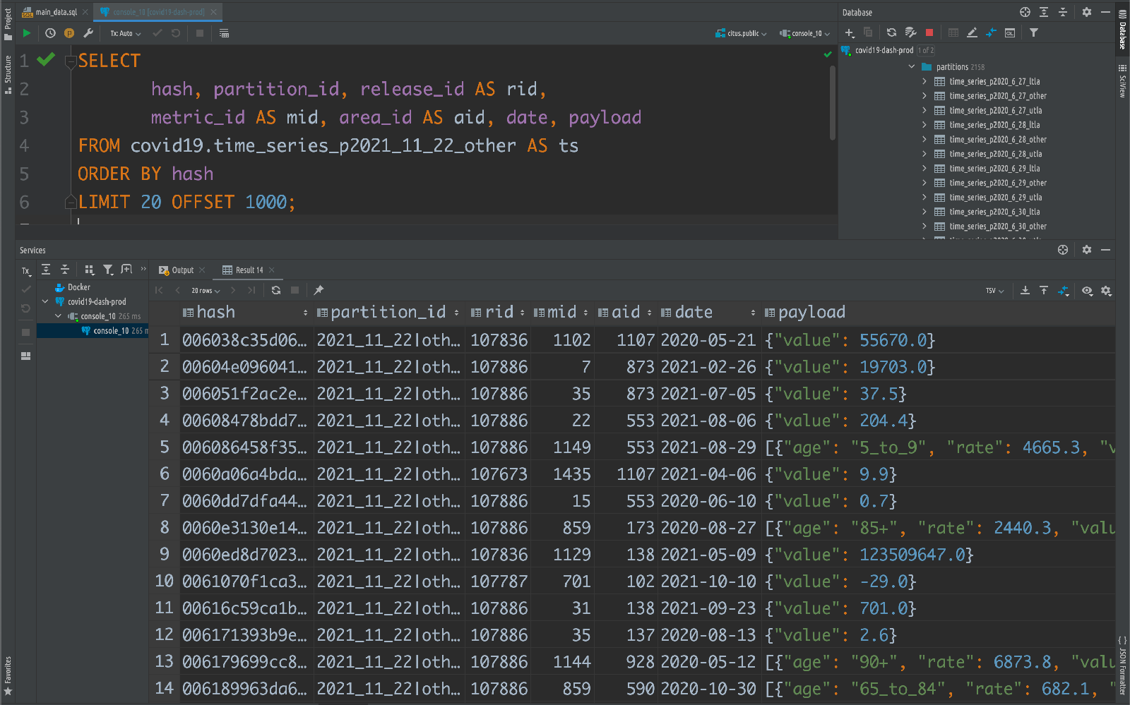
For the Citus distribution column (some of you might call this the sharding key), the team has done something unusual and has created a particularly granular column in their data model. They generate a 12-digit hash value using a BLAKE algorithm for fast hashing, calculated from 4 fields: release_id, area_id, metric_id, and date.
Distributing their data across the cluster by this hash value enables most of the SQL queries to be parallelized across the nodes in the Citus database cluster. The result: the query responses are quick enough to deliver the snappy, near real-time experience that the dashboard visitors have come to expect. Even when the visitor’s interactive queries are triggering all sorts of complexity under the covers.
At the same time, using a hash over something like a random UUID prevents duplication. There are times when the data needs to be updated after it has already been deployed to the database—e.g. when a new version is submitted by the source. In that case, having a consistent sharding key enables updates of the existing data.
Deep dive into database tuning for complex SQL queries
Migrating to Hyperscale (Citus) was straightforward—after all, Citus is an extension to Postgres and is compatible with tools in the Postgres ecosystem. Additionally, the UKHSA team and especially Pouria already had extensive experience in Postgres.
The team decided to migrate to Citus gradually, integrating different microservices at different times. They planned the upgrade such that the code for each microservice was updated and then deployed internally over a period of just over 1.5 months. The service was then subjected to extensive load testing—and meticulous QA by different members of the wider dashboard team—to ensure the integrity of the data before deployment to production.
While the UKHSA team was in the midst of migration and testing, they determined some performance tuning needed to be done for some of the more complex queries used by the UK Coronavirus analytics dashboard. To optimize performance, Pouria collaborated with the Citus database engineers on the Postgres team at Microsoft. Together, they tuned the database by adjusting settings for the max_locks_per_transaction, max_adaptive_executor_pool_size, and task_assignment_policy.
Max locks per transaction
When the team migrated the landing pages and postcode search pages—the most demanding part of the service in terms of the complexity of database queries—to run on top of Citus, they saw that latency was initially quite high. In some cases, the page would not respond and just fail. All transactions in the database would subsequently fail as well. They investigated and determined that the number of locks generated were the cause and that in some cases, there were as many as 120,000 locks in place. Those locks brought everything to a halt.
It turned out that querying using the partition_id was part of the issue. Everywhere in the application, including on the APIs, the queries were always directed at a single partition. Citus gives you the flexibility to do that, and when you do, you can decrease latency, especially with very large databases. However, in this particular case, because data is required from multiple area types, the query was using the partition_id instead of directly querying the partition. That was one of the reasons so many locks were being set all over the place.
The team began to address the issue by breaking a long, 250-line SQL query into subqueries. The long SQL query was used to present the number of cases in a particular postcode area, which requires a demanding set of operations.
The intention was to push these jobs down to individual workers and shards. To do that, the team decided to change the approach from using Postgres CTEs (Common Table Expressions) to using subqueries, and then subqueries of subqueries.
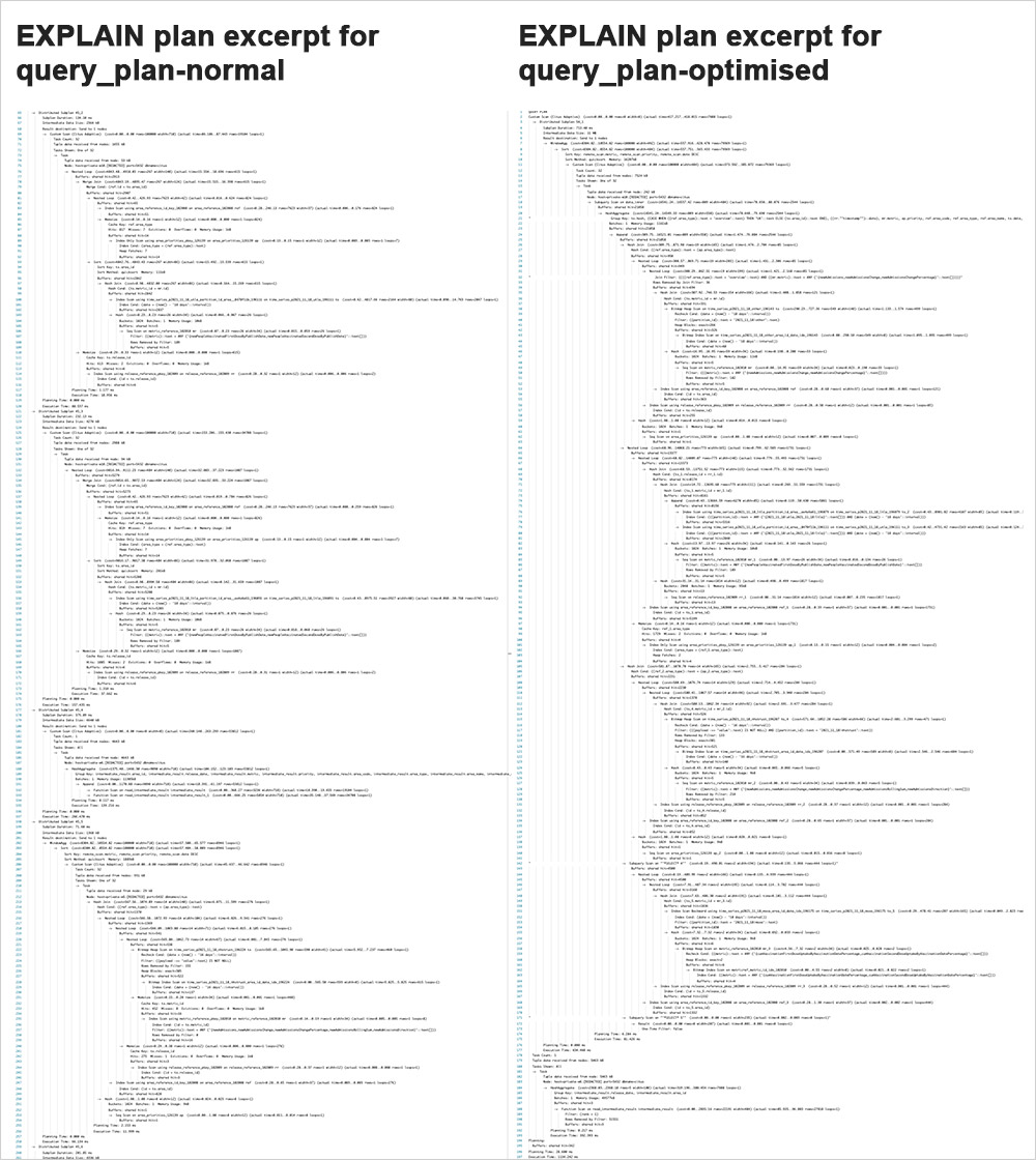
Below you can see a side-by-side comparison of the EXPLAIN plan for the SQL query before and after the optimization, with and without the query pushdowns. The entire SQL query (and query_plan) for both the normal/original query and the optimized-for-Citus query—can be seen in Pouria’s gist on GitHub.
In the side-by-side comparison of the Postgres EXPLAIN plans below, note:
- the normal query_plan on the left looks like a shark tooth
- whereas the optimized query_plan on the right looks like a simple wave
This is because in the optimized pushdown version of the SQL query, the subqueries do not return results to the Citus coordinator node one at a time, rather, thanks to Citus, the subquery results are returned in a parallelized way.
However, they learned that no matter how much they pushed the queries down and optimized, it would still create more locks than the system can handle.
The solution? Increase the PostgreSQL setting for max_locks_per_transaction. Instead of the default setting of 64, the Citus and UKHSA team changed the setting to 10,000—which matched the number of partitions per node. This is a problem that happens in Postgres when you query parent tables with a large number of partitions, especially when the partitions contain time series data. The issue is further amplified when the partitions are also sharded with Citus. In such cases, setting the maximum number of locks to a high number becomes critical.
After optimizing the query, changing the max_locks_per_transaction setting, and directly querying the Postgres partitions where possible, a much smaller number of locks are generated—usually no more than 400 at peak.
Max adaptive executor pool size
For certain types of SQL queries, Pouria and the Citus engineers also adjusted the citus.max_adaptive_executor_pool_size to limit the number of connections that Citus generates in the current session.
With Pouria’s sharding strategy, every single SQL query is parallelized across multiple nodes in the Citus cluster, both the simple and complex queries. The problem was that parallelizing simple, short lookup queries was adding overhead, because Citus had to create multiple connections across worker nodes.
So, the team set the citus.max_adaptive_executor_pool_size to 1 for short lookup queries, so that there is only one connection per node. For more demanding queries, including ones that do aggregations, the team set the max adaptive pool size to the default value of 16.
Capitalizing on this Citus flexibility to prioritize which types of SQL queries should get more or fewer connections was quite effective in the team’s efforts to optimize performance.
Round-robin task assignment policy
The analytics dashboard uses Citus to distribute 3 Postgres tables:
- the time-series table (
time_series) - the postcodes lookup table (
postcode_lookup) - a table with headline data (
private_report)
The rest of the Citus tables are either reference tables or local tables, which are local to the coordinator node. With Citus, by default, a query on a reference table will run on the first worker node, known as the "first replica".
Pouria changed the citus.task_assignment_policy setting to "round-robin" to avoid having every reference table query hit the same node. The round-robin policy assigns tasks to workers by alternating between different replicas. When SQL queries are on the Citus reference table—a frequent occurrence when using the Generic API—they will go to the first node in the cluster, then the second. Using multiple workers instead of just the first worker node enhances performance.
Key learnings for building a large, responsive application
Pouria shared a few more insights on how to architect an application that can handle a tremendous amount of time series data—and deliver a user experience with those 200 millisecond response times that feel so responsive.
Architecting the analytics service in a principled way
The pressure to deliver a new application quickly can sometimes steer an organization to build services the easy way. In the case of the UK’s COVID-19 analytics dashboard, failing to implement a proper structure for the database, or a proper structure for the code—or neglecting to architect an application that could be scaled—would have created major issues down the line.
What’s a proper structure for the database? Like everything else in software engineering, it depends on the specifics of a project. In this situation, Pouria’s team followed best practices in RDBMS design, data integrity, connection pooling, versatility and reusability of code, as well as developing a thorough understanding of the data. In fact, Pouria’s deep understanding of the data is the reason they chose to use a JSONB payload (combining RDBMS with NoSQL) to ensure they could accommodate unexpected needs that might arise in the future.
When Pouria and team started, they never thought they would have over 1 million unique users a day, nor did they think that they would have to accommodate 50 to 70 million hits per day. Although no one anticipated this level of growth and popularity, Pouria’s team did build a system that could accommodate future needs and enable distributed scale. That turned out to be a smart decision that made all the difference in the success and impact of the UK Coronavirus dashboard.
Implementing multiple layers of caching on top of your database
Caching is used to improve responsiveness and reduce latency during the enormous traffic spikes that the UK Coronavirus dashboard experiences every day at 4:00pm.
Pouria’s team uses multiple layers of caching that are meticulously choreographed to work in tandem and reduce the load directed at the database. They use Azure Front Door as a CDN cache (content delivery network) that caches all the query responses for a predetermined period of time.
They also have an API management (APIM)–level cache that uses Azure Cache for Redis. Pouria wrote a bespoke policy in APIM to generatea uniformly distributed random number for each request and caches the response for that period of time, in seconds. Doing so prevents the several hundred thousand caches from expiring (and being refreshed) at the same time.
Another Redis cache on Azure helps with postcode searches. This cache helps ensure that each part of a postcode look up query—which maps postcodes to all of the 6 area types for which the data are published—is only requested from the Postgres database once. Postcode requests are structured into different areas and then asynchronous calls are made to Redis. Only if Redis does not have the data is the request forwarded to the database.
Finally, Pouria has a client-side cache on the browser that is shorter than the CDN. Using all of these caches might not be common practice... but in the UK Coronavirus dashboard’s case, the caches help to maintain a responsive application, while ensuring the freshness of data that is presented. The expiry time for identical queries is different in different layers. This ensures:
- Freshness of data: client-side (browser) cache durations never exceed 2 minutes. This ensures the freshness of data and improve overall user experience.
- Reduction of short-term load: Website data are cached in the CDN, the duration of which also doesn’t exceed 2 minutes. This is particularly important because flushing CDN cache can take up to 10 minutes, which would cause extensive confusion for users when new data are released. The 2-minute period ensures that identical requests reach the backend at a lower frequency and thereby reduces the load on both APIM and Redis servers.
- Reduction of medium-term load with added contingency: Redis cache—the duration of which can be anything between 10 minutes to 8 hours for time series data and up to 2 weeks for generic data—are structured such that they are invalidated as soon as new data are released.
- Reduction of long-term load for large payloads: Storage-based caching for APIv2—which powers the downloads page that supplies data sets containing millions of rows—are retained indefinitely based on the release date to ensure that identical requests are only ever processed once.
Pre-populated cache with Azure Cache for Redis
Minutes or seconds before data is queried, approximately 9K items of cache are pre-populated in order to speed up response times for some chunky, complex SQL queries from approximately 920 ms to approximately 50 ms.
The chunky SQL queries are complex because not all metrics on the page are available for all areas every day. For instance, vaccination data in England are published at MSOA2 level, while in Scotland they are published at local authority level.
To support these types of SQL queries on the fly would require many UNIONs & JOINs and would take too long. By pre-processing this rather tricky part of the calculations, these SQL queries can be pushed down to the worker nodes in the Citus database cluster and thereby parallelized. And things are faster.
Distributing Postgres has been essential for scalability
For Pouria and the UKHSA team, the decision to use Azure Database for PostgreSQL—and to distribute Postgres across a cluster of nodes with Hyperscale (Citus)—has enabled the GOV.UK Coronavirus dashboard to deliver fast response times to millions of users. Even with an ever-growing time series data set.
With 7.5 billion records (and growing) in this PostgreSQL database—distributed across a cluster with Citus—the UK coronavirus dashboard has queries that execute in less than 3 milliseconds. Another example of the near-instantaneous performance that Citus on Azure provides: you can download an LTLA dataset that triggers a query and gives you over 5 million data points in under 10 seconds.
Pouria feels the type of data handled by the UK Coronavirus dashboard is probably one of the most demanding you could have in a database because it’s time series, it’s massive, and requires complex queries targeted at only a handful of rows to be processed in real time. It’s rare to deal with time-series data with this magnitude of transactions and this amount of data in each response. The term that Pouria uses to describe the number of Postgres database operations and the volume of data involved in each transaction is "absolutely colossal." The takeaway is that if Citus can handle this, it can likely handle any volume of data.
Acknowledgements
After collaborating on this blog post and reflecting on the work involved and the far-reaching impact of the GOV.UK Coronavirus dashboard, we wish to express the uttermost gratitude to all of our respective teammates—both at the UKHSA (formerly PHE) and in the Postgres and Citus team at Microsoft—who have worked on this project. Your contributions and collaboration have built the analytics dashboard into the service that it is today. In particular, a special shout out to:
- Clare Griffiths – Head of the UK Coronavirus Dashboard, UKHSA
- David Jephson – Deputy head of the UK Coronavirus Dashboard (data and pipeline), UKHSA
- James Westwood – Deputy head of the UK Coronavirus Dashboard (data and pipeline), UKHSA
- Bea Goble – Software and DevOps Engineer, UKHSA
......
- Marco Slot – Technical lead of the Citus database engine and Principal Engineer at Microsoft
- Sai Srirampur – Technical lead of Citus customer engineering and Principal Engineering Manager at Microsoft
—With our sincere thanks, co-authors Pouria Hadjibagheri and Claire Giordano
Footnotes
- Postgres enables you to query the parent table that is partitioned. Once you have the right filters in the query, Postgres automatically routes the SQL query to the right partition and executes it. That’s how many Postgres users take advantage of Postgres partitioning. In the case of the GOV.UK Coronavirus dashboard, the UKHSA team chose to directly query the partitions as a performance optimization, to reduce the extra planning overhead. ↩
- MSOA: Middle-Layer Super Output areas are statistical boundaries that contained around ~5,000 residents each when they were last created, around ~2011. The estimated population for each MSOA is updated annually by the Office for National Statistics. ↩

